library(igraph)
library(ADAPTSNA)
library(dplyr)13 Intermediate Network Visualisation
In the previous chapter, we talked about creating clean network visuals that are sized and proportioned well so as to reduce the visual noise of networks. Here, we take a step further and focus on telling a story through our visualisation. This is a delicate balance between cramming as much information as possible and keeping it clean. A general piece of advice is to err on the side of clarity! Just because you can, does not mean you should. In other words, adding more information does not necessarily make it a better visualisation.
| LEARNING ELEMENTS - Data Practices |
|---|
|
Following our case study of grime artists, we are bringing in our network data here and cleaning it up a little.
grime_edge_list <- load_data("GRIME_2008_Edge.csv", header = TRUE)
grime_nodes <- load_data("GRIME_2008_Nodes.csv", header = TRUE)

grime_08 <- graph_from_data_frame(d= grime_edge_list,
                                  vertices = grime_nodes,
                                  directed = TRUE)

grime_08_clean <- delete.edges(grime_08,
                               E(grime_08)[which_loop(grime_08)])
Notice that we are working with another .csv file (stored as grime_nodes) containing some more node attributes for our Grime artists. Let’s quickly define what we have in this dataset before we go any further. Below, we have the name of the artist, their role (artist, DJ, or crew) and whether they are male (0) or female (1). Then we have a numeric indicator for the number of categories they have listed on Spotify (including grime) and whether they span multiple categories (i.e. more than one genre). Then we have the date of their first release on Spotify, how many songs they personally released on Spotify in 2008 and whether they appeared in the UK top 100 charts in or by 2008 (1 = yes).
head(grime_nodes) name role female genre_cats cat_span first_release songs_no_
1 Asher D Artist 0 2 1 1988 0
2 Dizzee Rascal Artist 0 5 1 2003 0
3 Lethal Bizzle Artist 0 2 1 2004 0
4 Wiley Artist 0 4 1 2004 45
5 Treble Clef DJ 0 1 0 2004 0
6 Shystie Artist 1 2 1 2004 0
charted
1 1
2 1
3 1
4 1
5 0
6 1Now we are ready to start storytelling using our network! We can produce visualisations that tell a story about the relationships that exist between the individuals in the network and the individuals themselves. We cover techniques to alter elements of the network visualisation to reflect the vertex and edge characteristics we have access to. Such characteristics are network-specific (i.e. your network might have different attributes). However, we cover multiple common attributes (like tie strength or node demographics) to give you a sense of what you could do. First, we will talk about visualising edge characteristics, then we will cover node characteristics, and finally we end by visualising prominent and influential nodes using measures of centrality (more on what these are later on).
Visualising Edge Characteristics
We have one edge attribute in our network - a weight of how many times these musicians worked together in 2008. This is a fairly common type of attribute that we find in network data. Permutations of this could be a numeric attribute indicating the frequency of contact, or a character attribute indicating some form of descriptive about the relationship (such as like/dislike). Generally, there are three storytelling tools when it comes to working with edge attributes: the width, labels and colours.
Below thicker edges reflect more collaborations between the artists. We accomplish this by setting the edge.width to the edge attribute (E) called collab_weight. This sets the thickness of the tie directly to the numeric value of that attribute. This clearly demonstrates connections in the network that are ‘stronger’ than others. By now, we know this network a little bit and have established that Jammer and Wiley (the central “hubs” in the network) have many connections to others in the network. Using this method, though, we see thay they not only have many connections, but they also worked frequently with their many collaborators in 2008 (they have the thickets ties.
par(mar = c(0,0,0,0))
plot(grime_08_clean,
     edge.width = E(grime_08_clean)$collab_weight,
     edge.arrow.size = 0.5,
     vertex.size = 6, vertex.label = NA)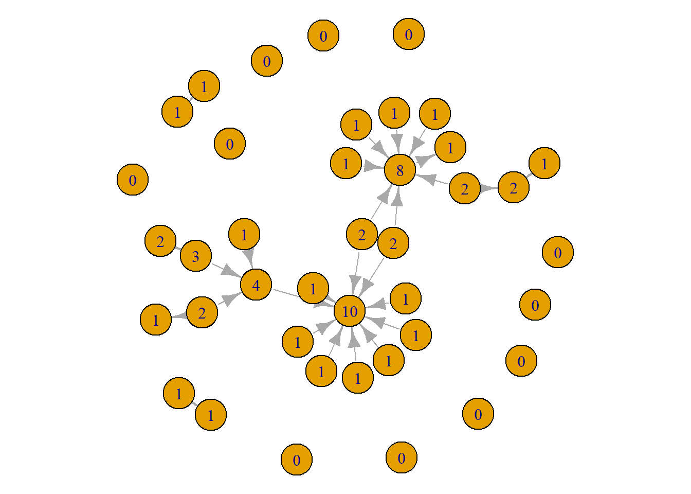
An alternative way to demonstrate this is to use labels instead of the thickness. The labels provide the exact frequency of collaboration. This is useful because it is hard decipher between an edge thickness of 4 vs. 5. But, if we visualise the weight as a label, it becomes much clearer. Check it out below. You might consider showing the labels of only those what have a certain (or higher than a specific) amount since showing labels on all edges gets a bit overwhelming.
par(mar = c(0,0,0,0))
plot(grime_08_clean,
     edge.width = E(grime_08_clean)$collab_weight,
     edge.label = E(grime_08_clean)$collab_weight,
     edge.arrow.size = 0.5,
vertex.size = 6, vertex.label = NA) 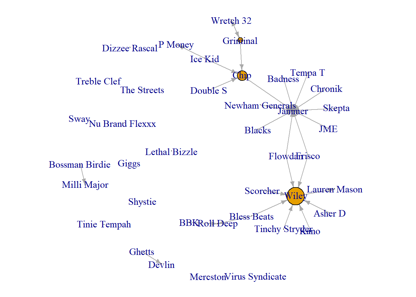
One other trick for the edges, we can set the edge colours to show those who collaborate frequently. Here we set the colour to red if the weight of the collaboration is above 2, otherwise it is black. For the sake of this visualisation, we set the node colour to a neutral white. This helps the edges pop a little more.
par(mar = c(0,0,0,0))
plot(grime_08_clean,
     edge.color = ifelse(E(grime_08_clean)$collab_weight > 2, "red", "black"),
     edge.arrow.size = 0.5,
     vertex.size = 6,
     vertex.label = NA,
vertex.color = "white") 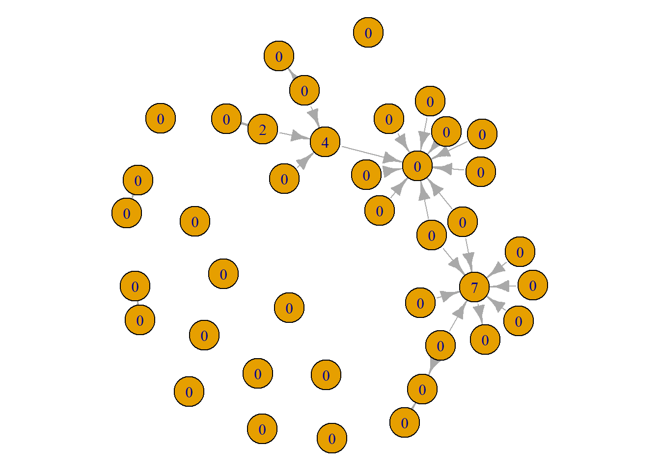
Visualising Node Characteristics
Next, we can use our node level characteristics to alter the visualisation and tell some more descriptive stories about the nature of our Grime artists. Again, we are going to lean on similar tricks using the colour and labeling options.
First, lets visualise the network to see the structural position of the male and female artists (many networks include similar demographic information). Below, we set the colour of the nodes to red for the female artists and white for the male artists. In sum, what we see is that there are not many female artists at all in 2008! Of the two female artists that were active during 2008, only one of them, Lauren Mason, actually collaborated with anyone else in our network.
par(mar = c(0,0,0,0))
plot(grime_08_clean,
     vertex.color = ifelse(V(grime_08_clean)$female == 1, "red", "white"))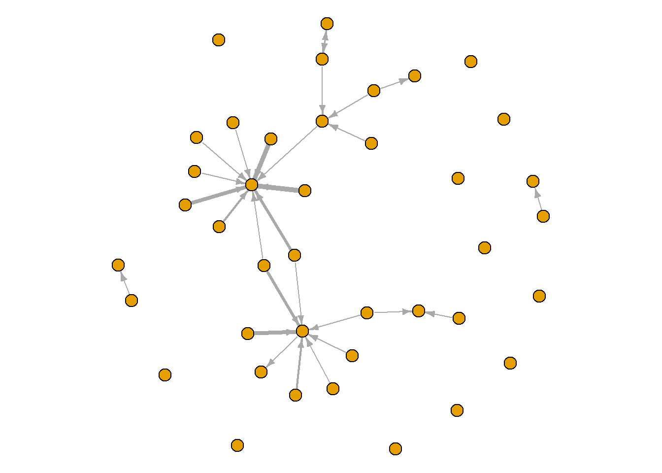
You can use similar tools for other node attributes other than demographics. For example, below we show those who have charted in or by 2008 in Green and we have changed the labels to show an F for the female artists and an M for the male artists. This network shows that the disconnected female artist has charted in or before 2008 while the one that collaborated in 2008 has not charted. Additionally, of our two main artists, Wiley and Jammer, one of them has not charted by this year. Interesting!
par(mar = c(0,0,0,0))
plot(grime_08_clean,
     vertex.color = ifelse(V(grime_08_clean)$charted == 1, "green", "white"),
     vertex.label = ifelse(V(grime_08_clean)$female == 1, "F", "M"),
     vertex.size = 10,
     vertex.label.cex = 0.5)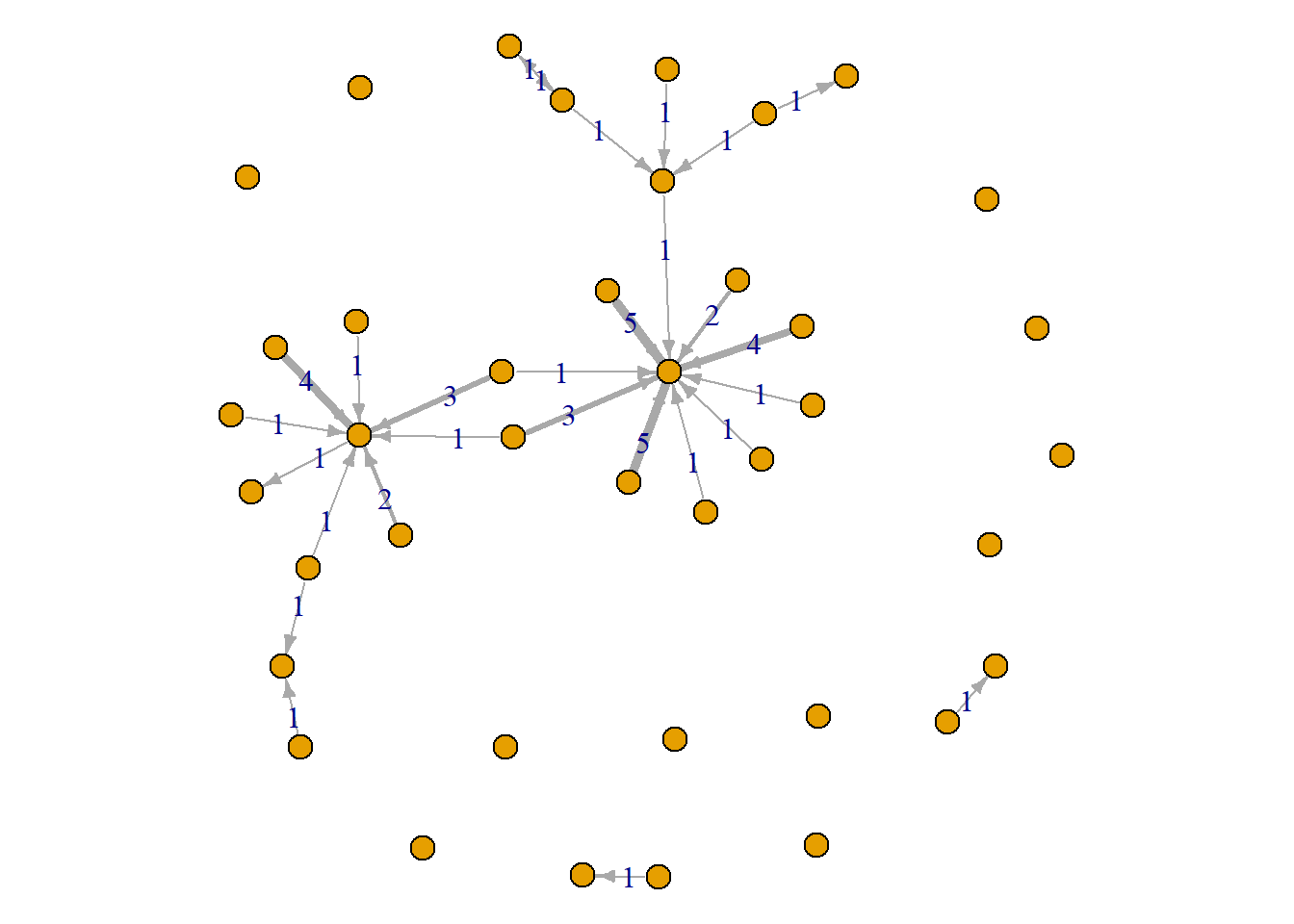
You might have character attributes that have more than two categories. In our case, we have the musicians’ role. Let’s see which of our nodes are artists and which primarily fill other roles in the genre. To look at this, first we can change the labels to the categories we have. The visual below shows us that most of our nodes are artists, there are five crews, two DJs and one group.
set.seed(123)
par(mar = c(0,0,0,0))
plot(grime_08_clean,
     vertex.label = V(grime_08_clean)$role,
     vertex.label.cex = 0.75,
     vertex.label.color = "red",
     vertex.color = "white")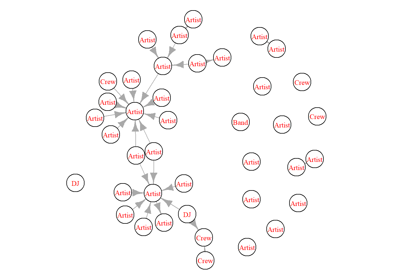
While the labels are helpful, we can make this even clearer in our visualisation. Below we use the “case_when” function to create a vertex characteristic that assigns a colour for each level of role that we have. What this does it combs through the ‘role’ characteristic and, if it finds what we want it to, it assigns a specific colour that we want. So, DJs are wheat, Artists are red, Crews are Cyan and Bands are purple.
V(grime_08_clean)$role_colour <- case_when(
  V(grime_08_clean)$role == "DJ" ~ "wheat",
  V(grime_08_clean)$role == "Artist" ~ "red",
  V(grime_08_clean)$role == "Crew" ~ "cyan",
  V(grime_08_clean)$role == "Band" ~ "purple"
)
Now we have that attribute set in our network, we can set the colour to reflect those colours. For the viewers, we have added a legend at the bottom left.
set.seed(123)
par(mar = c(0,0,3,0))
plot(grime_08_clean,
     vertex.color = V(grime_08_clean)$role_colour,
     edge.arrow.size = 0.5,
     vertex.label.cex = 0.4,
     main = "Node Size Relfects Artist Prominence")


legend("bottomleft",
       legend = c("DJ", "Artist", "Crew", "Band"),
       fill = c("wheat", "red","cyan", "purple"),
       title = "Node Colour")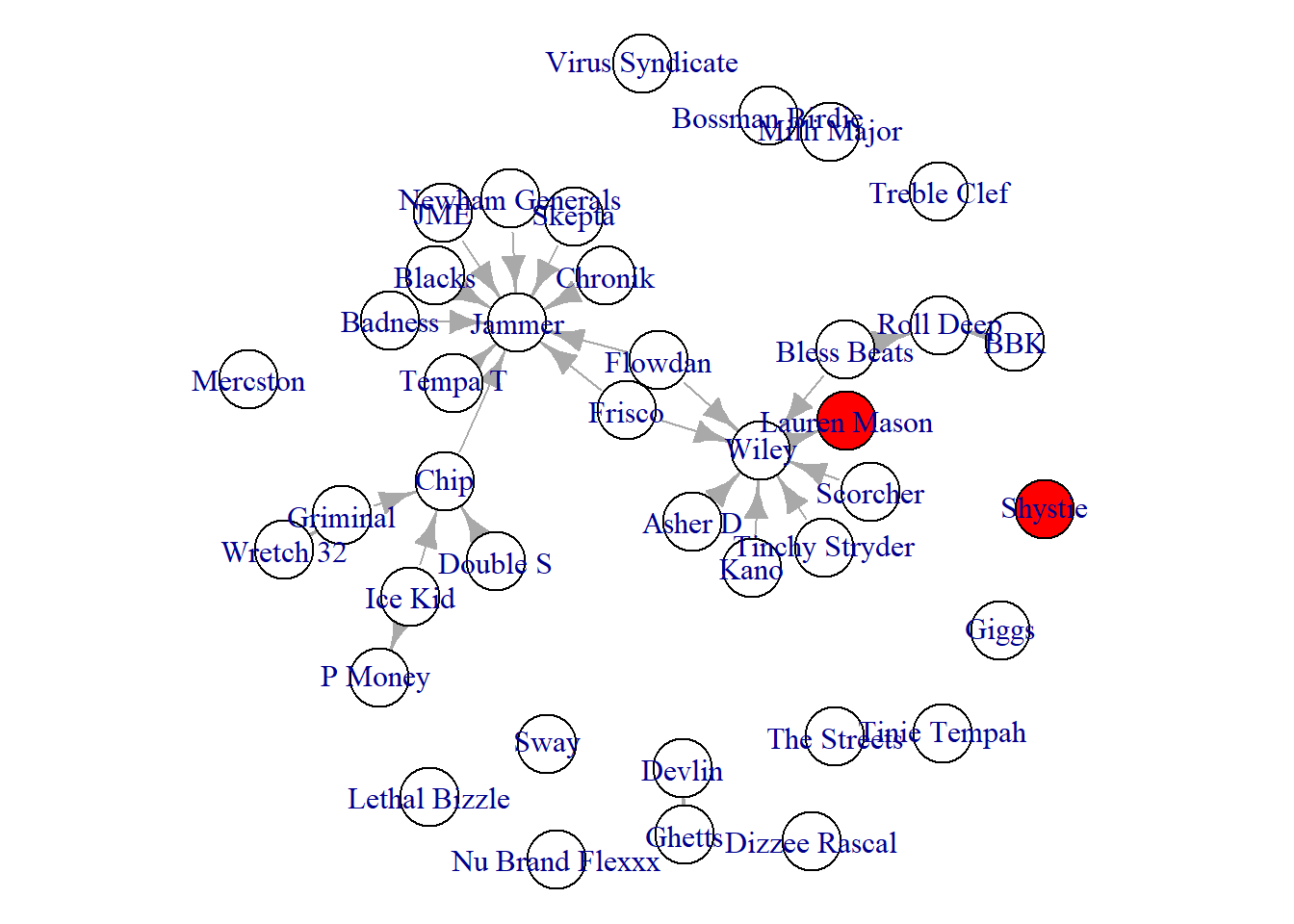
One final attribute we might want to visualise is the artist’s productivity in 2008. The number of songs they made in 2008 might be useful in our network to present whether the more highly connected individuals released more songs than other less connected Grime artists. Below we set the vertex.size option to the number of songs they produces (divided by 2 to keep it clean). This network reveals some interesting patterns. Yes, our two most connected artists have the largest node size (most songs), but many other artists (even those who are not connected) also released many songs (like Nu Brand Flexx).
par(mar = c(0,0,0,0))
plot(grime_08_clean,
     vertex.size = V(grime_08_clean)$songs_no_/2,
     vertex.label.cex = 0.4)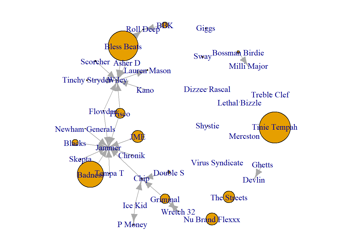
Visualising Prominent and Influential Nodes
A third, and final, storytelling tool is to create visualisations that highlight central figures in the network. There are multiple measurements of centrality and we will cover more of them in the next Unit. For now, we will create visualisations aimed at highlighting prominent and influential nodes in the network using two measures of centrality, degree and betweenness. Again, for more on those measures, hang tight and read later chapters.
For now, consider centrality as a way of understanding an individual’s position within a network. You may have heard someone described as “well-connected” — a phrase that typically refers to a person’s influence, power, or popularity within a social context. Centrality measures, grounded in graph theory, provide a formal means of quantifying this idea.
Individuals with many direct connections — those with high degree centrality — are considered prominent because they maintain relationships with numerous others in the network. Their visibility and accessibility position them at the center of group interactions. In contrast, individuals with high betweenness centrality — those who frequently lie on the shortest paths between others — are described as influential. This is because they occupy strategic bridging positions that allow them to mediate, facilitate, or even control the flow of information or resources across the network.
Prominence
First, to highlight prominent nodes, we could alter the size of the nodes commensurate to their score. So, if a node has a degree centrality of 10, their size would be 10. The difference in degree centrality generates differences in size that show one as more prominent than another. Quick tip here, humans don’t see size differences that well, especially between circles. With that in mind, we can change the shape to squares.
par(mar = c(5,0,0,0))
plot(grime_08_clean,
     vertex.size = degree(grime_08_clean)*2,
     edge.arrow.size = 0.5,
     vertex.label.cex = 0.5,
     vertex.shape = "square",
     sub = "Node Size Presents More Prominent Artists")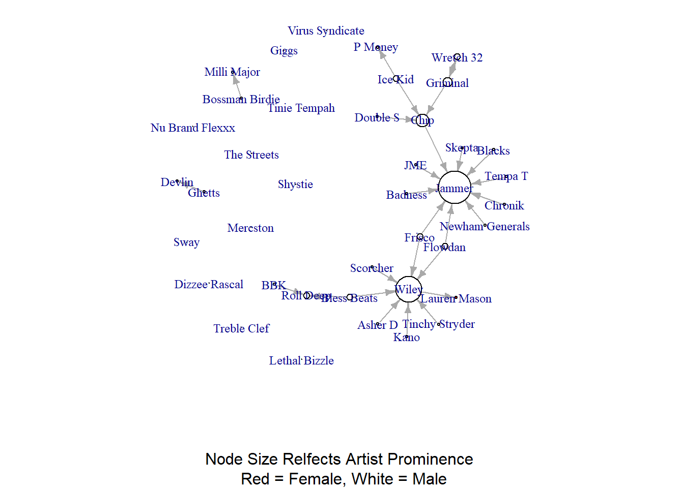
Even though we used squares, seeing the difference between nodes might be difficult since a node with a degree of 10 vs. a node with a degree of 9 are close in size. We can apply the same workaround that we did above when visualising the edge widths and use the node labels to reflect the score. That way people can read the scores directly.
par(mar = c(0,0,0,0))
plot(grime_08_clean,
     vertex.label = degree(grime_08_clean))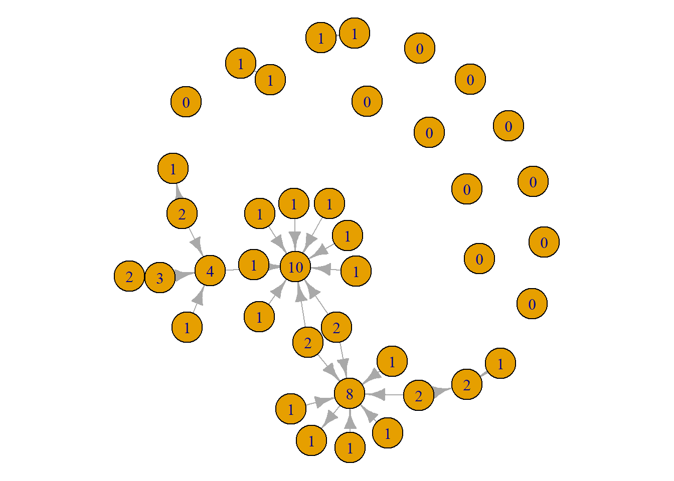
This tells the same story as the first visual. However, there are some pros and cons to this approach. The positives are that viewers can easily see the differences in scores. The drawbacks are that it produces a slightly more noisy visualisation. A viewer will need to look through the whole network to identify those with high scores. With this network, it might be better to use the size since the visual looks a little cleaner. As always, trial and error prevails! Give both a go and see what works better. Or, present both!
Below, we have a slightly more advanced visualisation to demonstrate the prominent artists in the network. See if you can follow the code. Pay special attention to the “ifelse()” statements. Again, just to drill this home for you, the logic for these statements is “if this paramter is true, then do this, else do that.”
plot(grime_08_clean,
     vertex.label = ifelse(degree(grime_08_clean) > 4, V(grime_08_clean)$name, NA),
     vertex.label.cex = 0.4,
     vertex.label.color = "black",
     vertex.color = ifelse(degree(grime_08_clean) > 4, "cyan", "purple"),
     vertex.size = 10,
     edge.arrow.size = 0.25)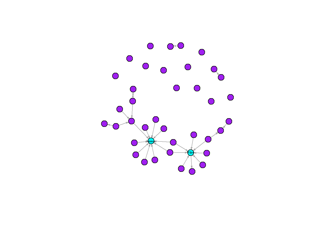
The graph above combines multiple techniques to emphasise the two highly connected artists in Grime 2008, Wiley and Jammer. Following the above recipe for the the “ifelse()” statement, we can interpret the first statement as “if the node in the network has more than four connections then set the label as the node name, else leave it blank.” Using the same logic, we changed the colours of the nodes. Doing this maximises the contrast between our focal highly connected nodes and reduces the noise of the labels allowing viewers to see the names of the artists.
Influence
We can do the same thing to highlight influential nodes in our network by using the “betweenness()” function into the plot. Quick reminder here, this measurement identifies nodes that bridge across the network. We can repeat the process that we used to visualise the prominent nodes here too beginning by altering the size of the nodes.
par(mar = c(0,0,0,0))
plot(grime_08_clean,
     vertex.size = betweenness(grime_08_clean)*2,
     edge.arrow.size = 0.5)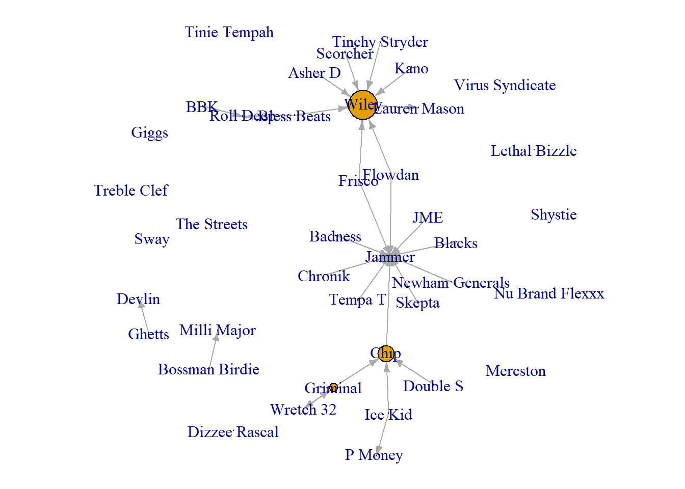
Again the same limitations and strengths apply here as they do when visualising prominence. The size may not be the most useful. So, we could use the labels.
par(mar = c(0,0,0,0))
plot(grime_08_clean,
     vertex.label = betweenness(grime_08_clean))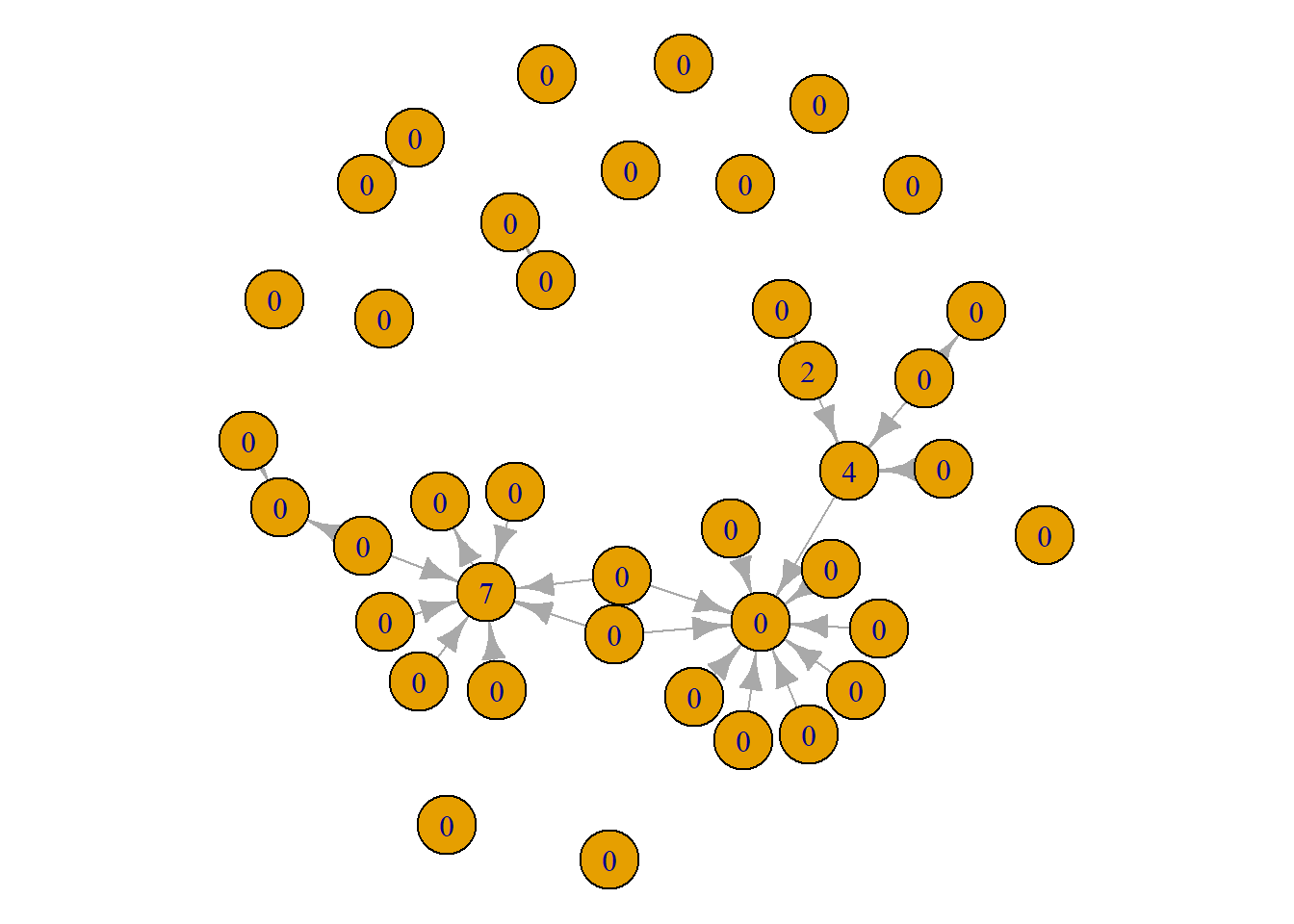
Finally, we can create a similarly styled advanced visualisation as above but focusing on the betweenness centrality.
plot(grime_08_clean,
     vertex.label = ifelse(betweenness(grime_08_clean) >= 2, V(grime_08_clean)$name, NA),
     vertex.label.cex = 0.4,
     vertex.label.color = "black",
     vertex.color = ifelse(betweenness(grime_08_clean) >= 2, "cyan", "purple"),
     vertex.size = 10, edge.arrow.size = 0.25)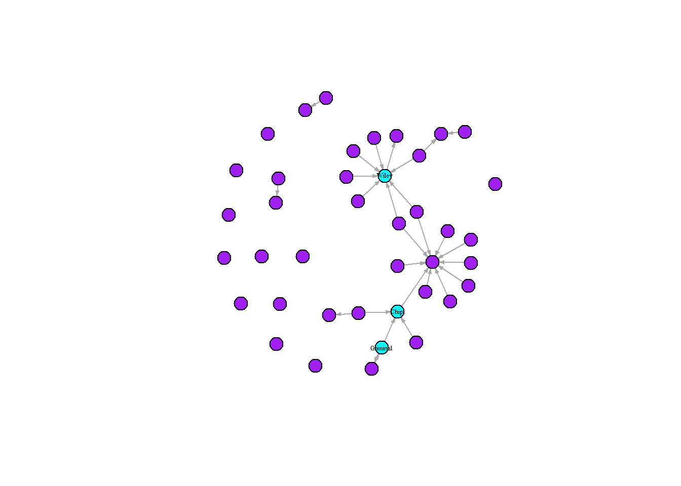
Just for a quick comparison between these measures and what stories we can tell by using them, let’s do a side-by-side. Notice here, that there different artists appear to be influential that are not very prominent and some that are prominent but not influential. This has to do with the differences between the measures since they capture different things. Again, for more on this, read on!
par(mfrow = c(1, 2))
set.seed(123)
plot(grime_08_clean,
     vertex.label = ifelse(betweenness(grime_08_clean) >= 2, V(grime_08_clean)$name, NA),
     vertex.label.cex = 0.4,
     vertex.label.color = "black",
     vertex.color = ifelse(betweenness(grime_08_clean) >= 2, "cyan", "purple"),
     vertex.size = 10, edge.arrow.size = 0.25,
     main = "Influential Nodes in Blue")

set.seed(123)
plot(grime_08_clean,
     vertex.label = ifelse(degree(grime_08_clean) > 4, V(grime_08_clean)$name, NA),
     vertex.label.cex = 0.4,
     vertex.label.color = "black",
     vertex.color = ifelse(degree(grime_08_clean) > 4, "cyan", "purple"),
     vertex.size = 10,
     edge.arrow.size = 0.25,
     main = "Prominent Nodes in Blue")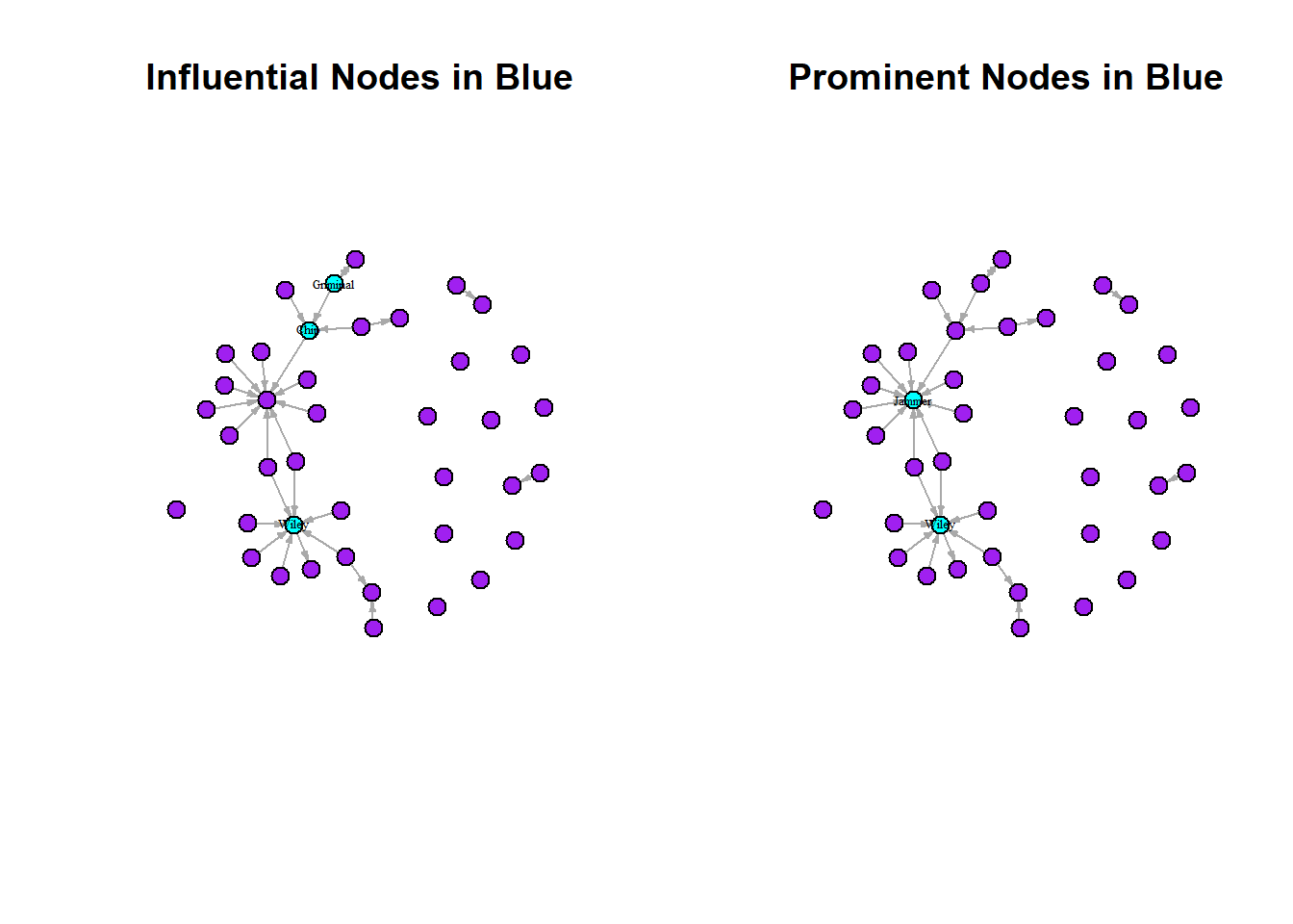
Finally, we can combine some of these techniques with our other principles of intermediate visualisation to tell different stories. For example, creating a network visualisation showing the sex of the artist alongside their prominence. Take a look at this visualisation below and see what it tells us. Are the prominent and influential artists mostly male or female? Also note, that we use a new parameter option here. The “oma” option creates an outer margin that sits outside the main plot window wherein we put the main title.
par(mfrow = c(1, 2))
par(mar = c(0, 0, 3, 0),
    oma = c(0, 0, 3, 0))

set.seed(123)
plot(grime_08_clean,
     vertex.size = degree(grime_08_clean) * 2,
     vertex.color = ifelse(V(grime_08_clean)$female == 1, "red", "white"),
     edge.arrow.size = 0.5,
     vertex.label.cex = 0.4,
     main = "Prominence")

set.seed(123)
plot(grime_08_clean,
     vertex.size = betweenness(grime_08_clean) * 2,
     vertex.color = ifelse(V(grime_08_clean)$female == 1, "red", "white"),
     edge.arrow.size = 0.5,
     vertex.label.cex = 0.4,
     main = "Influence")

mtext("Centrality Measures in the Grime Network",
      outer = TRUE, cex = 1.2)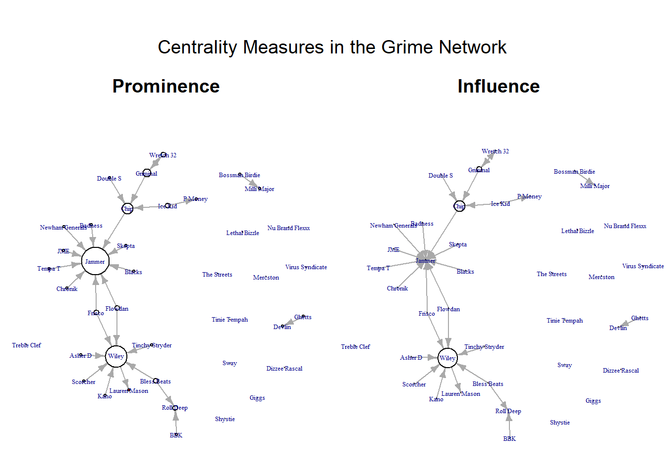
For the astute among you, notice that I multiply the centrality score by two in the vertex.size option? I did this to increase the size of all nodes to better visualise the nodes. Since we multiplied all by the constant (2) the comparison between the sizes of the nodes are just as valid. In some cases, certain nodes may have a raw centrality score that is massive. In this instance, you may want to divide the size by a constant like that. Just a little trick to help you keep your visualisation clean.
Summary
Network visualisation is about telling a story, not just producing clean graphs. By adjusting visual elements such as node size, colour, and labels, we can highlight important attributes of the people and relationships in the network. To summarise, then, here we have:
Showed how edge weights can communicate the strength of relationships between nodes.
Incorporated node attributes to add further context, allowing for richer and more informative visualisations.
Used degree centrality to show prominent nodes and betweenness centrality to identify influential nodes, demonstrating how different measures reveal different roles.
Overall, effective network visualisation involves making deliberate design choices to clearly communicate the key patterns within the data. These patterns can aid you with your storytelling. Visualisation is all about communicating key points to your audience. Here we have covered some intermediate to advanced techniques for manipulating your visualisation to tells stories about the nature of the people and the relationships between them.
Fun stuff!